
My Data Mural work has led me into a new area – actually helping community groups find the stories they want to tell in their raw data. Until now, all my data therapy work has focused on how to present the data-driven stories more creatively. This post shares some of the techniques I’m trying out.
Step 1: Speak like a normal person
I know, it should be obvious, but too often when entering the realm of data-anything, we fall back into using big words. That doesn’t fly when working with community groups that don’t have a shared meaning for those words. I tried to figure out how to use regular words to talk about the types of stories that you can look for. I came up with this set to start with:
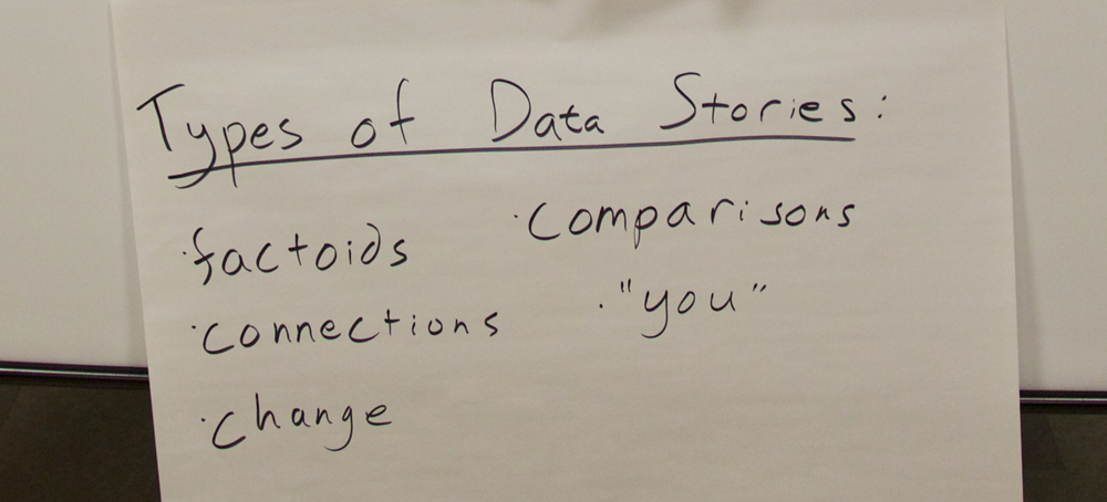
- comparison: you see two pieces of data that are really interesting when compared to each other
- factoid: you see one fact that jumps out at you as particularly interesting or startling
- connection: you see a connection between two pieces of info – you can’t say one causes another, but they’re interesting when put together
- personal: you have a compelling story or picture that is about one person
- change: you see one of your measures changing over time
I used regular words to describe the types of data stories in order to make the activity less intimidating to non-data people. Many people nodded their heads as I described these categories (especially at the second workshop where I spoke about them better!). I was inspired by the Data Stories section of the Data Journalism Handbook.
Step 2: Try it out together first
To come up with a shared definition of what these types of stories meant, I showed a few data points from an amusing data set – the Somerville “Happiness Survey” (raw data).

We quickly tried to find stories of each type in this tiny data set. Practicing all together on a tiny dataset can create a shared language for finding stories in data. In the breakouts that followed this activity, I could hear people using some of these words with each other to talk about the data they were looking at.
Step 3: Use less data
Usually data analysis starts with a giant set of documents. This model doesn’t really work for a small community group made up of people that aren’t data nerds. For our “story-finding” workshops we culled down the full data they gave us, producing a 4-page data handout for people. Limiting the data helped the community group not be overwhelmed by the task of finding a story they wanted to tell. We definitely made some “editorial” decisions that limited the stories they could find, but we did this with the help of a smaller group of our community partners so it wasn’t arbitrary.
So how did it go?
We scaffolded the story-finding around the idea of telling a story in our “The data say____” format. This gave us a common way to talk about the stories with each other. Just as importantly, this forced each person to justify why they thought it was a compelling story to tell in mural form.
 So did we build the group’s capacity for data analysis? Our pre-post survey did NOT show a noticeable increase in people’s self-assessed ease of finding stories in data. Damn. But wait… the answer is probably more nuanced than that. They did say they came away with more knowledge about the topic the data was about. They also said one of the most interesting things they learned was “telling data stories”, and in each of these two pilots they came out with a data-driven story that they wanted to tell.
Is exposure to data story-finding a sufficient outcome? Am I trying to do too much capacity building all at once? I’m still pondering how to do this better, so please suggest any tips!
Curious about these pilots? You can read some more on my collaborator Emily’s Connection Lab blog:
Cross-posted to the MIT Center for Civic Media blog.


You must be logged in to post a comment.